In today’s Pharma Marketing News, I reviewed three “workarounds” that might allow pharma marketers to post promotional tweets that satisfy FDA’s recently published (18 June 2014) guidelines:
- Chain of Tweets
- Tweets with Images (see “A Type of Rx Drug Tweet FDA Did Not Consider in its Recent Guidance“)
- Twitter Cards
Spoiler Alert: They both probably won’t pass muster with the FDA.
What about Twitter Cards?
A little Twitter bird told me that Twitter Cards, which allow your tweets to go beyond basic text, are the best way for pharma marketers to work around FDA’s new guidelines. Brands can create a media-rich experience through images, product info, videos, etc.
There are several types of Twitter cards. One type — Summary Cards — gives you 200 extra characters besides the tweet itself. For most drugs, this is probably enough room to include all the desired benefit information, plus the FDA-required important safety information (ISI) and link to full ISI.
There’s only ONE problem with Twitter Cards and it’s a BIG one as far as promotional Rx drug tweets are concerned. That problem can be summed up in ONE word:
There is no doubt that most of us use our small-screen mobile devices (i.e., smartphones) to access social media platforms such as Twitter and Facebook. Any promotion, therefore, that uses those platforms must be compliant when viewed on smartphones. FDA did not mention this in its recent guidance document, but that doesn’t mean they are not looking at ads on mobile devices.
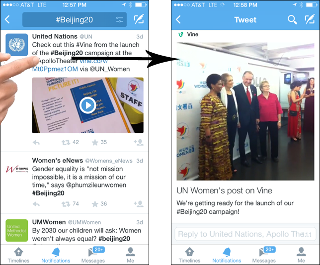
So what’s the problem with Rx Twitter cards on smartphones? The following screen grabs from my iPhone illustrate the problem:
While it is possible to see and play the video within the normal timeline, if you want to see the full message — including those precious extra 200 characters — you have to, GULP!, click on the tweet! In other words, what we have here is a failure to communicate the necessary information without clicking! And as we all know, the “one-click rule” has been smashed by FDA in the famous 14 Notice of Violation letters that the Agency sent out on a single day in April, 2009.
Of course, there’s still the first 140 characters in the tweet that you can see without clicking. But the assumption is that for most drugs this is NOT enough space to satisfy FDA guidelines, especially for newer, more complicated drugs (i.e., biologics), which will most likely have the biggest ad budgets in the future.
What about the video and/or image that can be included in a Twitter Card? Couldn’t those be used to convey the necessary fair balance?
Yes, they can, as I indicated in a previous post (see op cit). However, Twitter doesn’t recommend conveying fair balance in an image because the text may not be large enough to read on small-screen mobile devices. Also, to view the video, you have to … you guessed it! CLICK IT!


![6 Digital Tools at the Center of Healthcare Digitalization [INFOGRAPHIC]](http://ec2-54-175-84-28.compute-1.amazonaws.com/pharma-mkting.com/wp-content/uploads/2021/04/6DigitalTools_600px-100x70.jpg)


