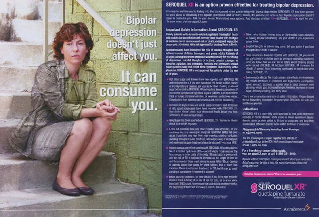
There’s a bit of brouhaha in the Twitterverse about a recent Seroquel XR print ad that imitates the art of Chinese artist Liu Bolin (see “Liu Bolin and JaeSelle – what’s the connection?“). “Both feature people camouflaged against their backgrounds so that they almost disappear,” said Jim Edwards over at bnet. Some say this is a despicable corporate ripoff of art. Here’s the ad:
Personally, I don’t find anything wrong with advertising images that are inspired by artists and I certainly do not think Liu Bolin has any case against the ad agency (Saatchi & Saatchi Healthcare) for copyright infringement.
When I first saw this ad, I didn’t get the connection because (1) I didn’t notice the camouflage effect, and (2) I had never heard of Liu Bolin, nor seen his art. So I am happy the ad introduced me to the world of Liu Bolin and I can now better understand the ad’s message, thanks to Jim Edwards et al. Too bad that message escaped me when I first saw the ad, as I am sure it escaped many other people.
The real problem with this and so many other Rx drug print ads is the extraordinary amount of space devoted to imagery. In this case, 50% of the 2-page ad consists of the image. Of course, there’s a statement about bipolar depression within the graphic. This is meant to explain what the graphic depicts — something Liu Blin would not do with his art — and only indirectly the benefit of Seroquel.
What I think is the real problem of this Seroquel XR ad is the lack of benefit information and the space wasted on the image. While the ad devotes quite a bit of space — maybe 40% — to risk information (not including the 6 pages of legalese that follows the ad), only about 10% of the ad (not including the statement within the image) is dedicated to benefit information.
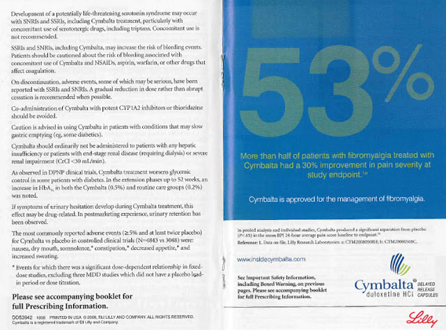
How does this compare with other print ads? The following Cybalta ad, which appeared in the WebMD Little Blue Book Rheumatology edition, was cited by the FDA for “[failing] to present risks associated with a drug with a prominence and readability reasonably comparable with the presentation of information relating to the effectiveness of the drug” (see here):
About 37% of this ad — if you consider this 2-page spread a single ad — is devoted to benefits. Although 50% of the ad is devoted to risk information, the FDA was not satisfied: “This efficacy claim is presented in very large bolded yellow font on a blue background with significant white space. The risk information is presented on the preceding pages in black, smaller font size, in single-spaced paragraph format, and the header “Important Safety Information for Cymbalta® (duloxetine HCl)” is presented two pages before the efficacy claim (in the reverse order in which this information is typically presented), making it not visible to viewers looking at the efficacy spread. This overall presentation misleadingly minimizes the serious risks associated with Cymbalta because it fails to convey this important risk information with a prominence and readability reasonably comparable to the efficacy claim.”
The Seroquel ad, therefore, is not likely to catch any grief from the FDA as did the Cybalta ad. But there are plenty of ads out there that do not include enough fair balance.
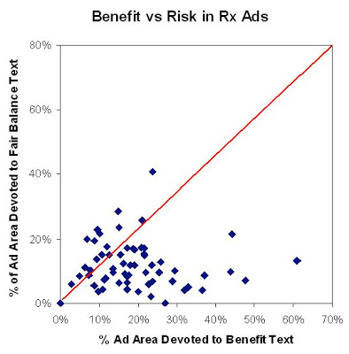
Some time ago, I collected over 60 print drug ads that appeared in several major consumer magazines and measured the space allocated to images, benefit statements, risk information, and the brief summary. What I found was that, on average, the images in these ads occupied 46% of the total ad space (similar to the Seroquel ad), whereas benefit statements took up 19% and risk information about 12%. The chart below summarizes my findings:
You can read about my Print Ad study here: “Print DTC: How Does It Measure Up?” (pdf; FREE!)


![6 Digital Tools at the Center of Healthcare Digitalization [INFOGRAPHIC]](http://ec2-54-175-84-28.compute-1.amazonaws.com/pharma-mkting.com/wp-content/uploads/2021/04/6DigitalTools_600px-100x70.jpg)


