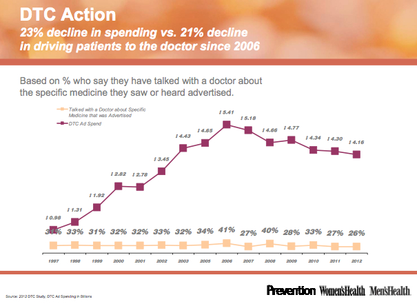
There’s a lot of interesting data in that study, but I will focus on one chart that documents DTC (direct to consumer) ad spending by the pharmaceutical industry from 1997 through 2012. Here is the chart:
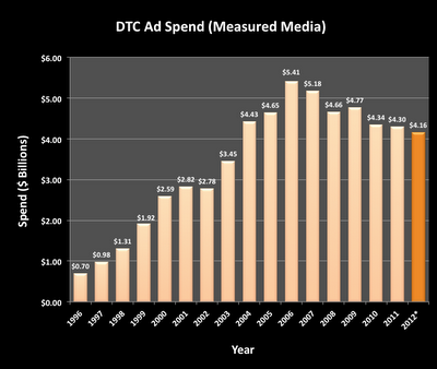
I noticed that the “DTC Ad Spend” data (top line) looked familiar. Sure enough, when I searched through my Pinterest “Charts & Data” board, I found a chart that I created back in April 2012 (see “Lipitor Holds Key to DTC Ad Spending in 2012“; the chart is shown below):
All the numbers regarding DTC Ad Spending are the same in the two charts. In other words, Rodale copied my data to the “penny,” but did not credit me as the source. In fact, Rodale did not cite any third party as the source!
OK, I didn’t get credit. Big deal. I’m not complaining because I didn’t get my 15 minutes of fame. The problem is that my original post did cite the source of my data and the last two columns (for 2011 and 2012) were estimates based on a few assumptions. Here’s what I said:
“This chart actually plots measured media data (excluding Internet display and search advertising) through 2010 from AdAge, which got the data from TNS Health. I calculated the 2011 total based on the 1% decrease reported by Nielsen (sorry, I don’t have TNS data for 2011).
“The final bar of the chart is my estimate for 2012, which is based on the premise that DTC ad spending for Lipitor will be less than half of what it was in 2011.”
So, thank you Rodale for repeating my estimated data for 2011 and 2012, but you should have included the above information about how those estimates were calculated!
P.S. BTW, it is possible — but not probable — that my estimates were right on and the Rodale chart is based 100% on new data from AdAge/TNS/Nielsen.


![6 Digital Tools at the Center of Healthcare Digitalization [INFOGRAPHIC]](http://ec2-54-175-84-28.compute-1.amazonaws.com/pharma-mkting.com/wp-content/uploads/2021/04/6DigitalTools_600px-100x70.jpg)


