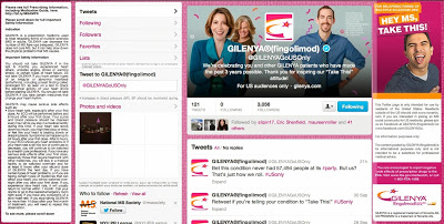
Shame on me! I was unaware until today of @GilenyaGoUSOnly, an Rx-branded Twitter account run by Novartis, which markets Gilenya for the treatment of Multiple Sclerosis (MS). This Twitter account has been “active” since November 22, 2012, when it published its first tweet. To date the account has posted only 121 tweets (an average of 10 tweets per month), follows nobody, but has over 3,000 followers (I just became a follower this morning).
For the record, here’s a screenshot of the Twitter account (click on it for a full-sized view):
When the FDA, this past August (29 AUG), issued a warning for patients who take Gilenya after a patient taking the drug developed a rare but serious brain infection (see here), @GilenyaGoUSOnly was silent on the topic. That day @GilenyaGoUSOnly tweeted: “Interested in tips for straight talk with your doctor about GILENYA? Learn more: http://bit.ly/10vWfBX #USonly” The following day it tweeted about BBQing: “We’re excited for #LaborDay barbecues! #LongWeekend #USonly”
This irks me because I — like may others — think pharma can best use Twitter not only to remind people about what to tell their physicians or to have fun BBQing, but also to notify patients about drug recalls, counterfeit drugs, or drug safety warnings (see, for example, “Twitter for Brands: Beyond Marketing“). Obviously, @GilenyaGoUSOnly doesn’t believe that kind of support is useful.
That’s one bone I have to pick with @GilenyaGoUSOnly. I also could criticize @GilenyaGoUSOnly for engaging in “reminder” advertising; i.e., posting tweets mentioning the drug name without saying what it treats. This allows Novartis marketers to place ads for the product without having to mention major side effects. Reminder direct-to-consumer (DTC) ads for print and TV were banned by PhRMA’s DTC guidelines. Unfortunately, these guidelines do not apply to the Internet or social media. As print and TV become less prevalent as ad vehicles for pharma, these guidelines become more and more archaic unless they are expanded to cover Internet-based DTC, IMHO.
Reminder ads are a minor issue. What about this “US Only” baloney? I’m critical of @GilenyaGoUSOnly for it’s tongue-in-cheek posts that remind its 3,000 plus followers that the tweets are for U.S. followers only. As if the non-U.S. followers immediately stop following because Novartis says this is not for them! If I were an EU follower I would have retweeted that post with a “LOL!” addendum.
But leaving all that aside, I would like to point out another issue I have with @GilenyaGoUSOnly — the side effects listed in the left-hand sidebar. The main problem is that ALL the major side effects may not be visible on all computer screens. Even though it says “To see more, scroll down,” you cannot scroll down to see more side effects. First of all, there is nothing below to scroll down to. Secondly, Twitter only allows you to scroll down through the tweets, not through the background image which contains the side effect information.
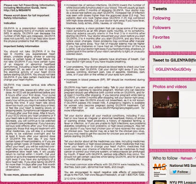
@GilenyaGoUSOnly deals with this problem by placing the second-half of the side effect sheet to the right of the first-half. Unfortunately, unless you expand the browser out to 1920 pixels, you won’t be able to see the second half (as shown in the screen shot below).
I wonder if this is technically possible for many people. Not to mention the size of the text, which is probably too small for many people who suffer from MS.
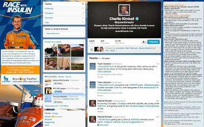
I made a similar criticism of Novo Nordisk’s @RaceWithInsulin — the ONLY other Rx branded Twitter account (see “Can You Read This ‘Fair Balance’ on Race With Insulin Twitter Page, or Is It Just Me Having Problems?“). As a result, Novo changed it’s Twitter page design and made the fair balance information much more patient-friendly and readable (see screenshot below).
Even so, this information may not be visible unless the screen is wide enough to include it.
Now that Twitter is planning to go public and make more money through advertising, it should work with the pharmaceutical industry to allow the fair balance/side effect information to be displayed in a box within the SCROLLABLE center section of the screen. That’s my opinion and I’m sticking to it!


![6 Digital Tools at the Center of Healthcare Digitalization [INFOGRAPHIC]](http://ec2-54-175-84-28.compute-1.amazonaws.com/pharma-mkting.com/wp-content/uploads/2021/04/6DigitalTools_600px-100x70.jpg)


