Last week I received a special edition of Newsweek Magazine devoted to “The Future of Medicine.” The issue touted new treatments coming our way in the 21st century.
Unfortunately, the drug ads in the magazine were still locked into late 20th century thinking.
Take the 2-page ad for Topamax, a migraine (headache) treatment. Nice ad, most of which was occupied by a huge photo of three women yukking it up in a beauty salon. Along the bottom half-inch of the ad, in type of similar size to most of the body type, was “Important Safety Information,” or what the industry calls “fair balance.”
In the 21st century drugs will still have risks, despite the rosy pictures of the future depicted in Newsweek. (One such picture is a little freaky. It shows a mom of the future, all decked out in futuristic hairdo and clothing, handing her teenage daughter what appears to be a magic pill, which positively GLOWS. Everyone is smiling.)
No pharma company today would employ such spooky imagery to promote their products. Ads are about the promise of the product, not the product itself. That’s why the Topamax ad shows happy people free of migraine.
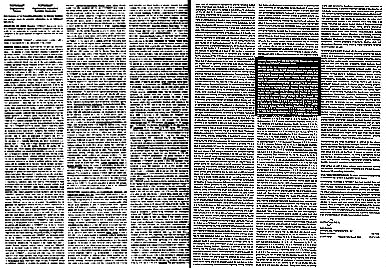
Anyway, I digress. Back to the fair balance at the bottom of the Topamax ad. The text ends by saying: “Please see brief summary of full Prescribing Information on next page.” What you see when you turn to the next page is this:

This is what’s called the “brief summary.” It has often been said that the brief summary is neither brief nor a summary. You can tell that just by looking at the image.
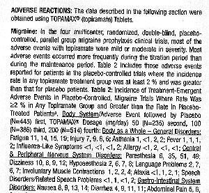
Note: the area highlighted in the image is enlarged below to give you some idea of the complexity of the language:

CAN’T READ IT? IT DOESN’T MATTER. YOU WOULDN’T UNDERSTAND IT. BELIEVE ME.
Back in February 2004, the FDA issued long-awaited draft guidance documents designed to improve communications to consumers (see “FDA Draft Guidance for Print DTCA: Less than Feared“).
The draft guidance “Brief Summary: Disclosing Risk Information in Consumer-Directed Print Advertisements” encourages manufacturers to use clearer, less cluttered formats for presenting risk information and encourages them to focus their risk disclosures on the most important and the most common risks and to do so in language easily understood by the average consumer.
In print ads, pharmaceutical companies have traditionally satisfied the brief summary requirement by including the entire professional package insert on a separate page. This is precisely what the Topamax ad does. I shouldn’t single out Topamax because other Rx DTC ads in the magazine followed the same basic pattern.
The Future of Drug Print Ads
How nice it would have been for drug companies to show us DTC ads of the future alongside the futuristic editorial visions in the Newsweek special edition! What this would look like can be imagined if drug companies followed FDA guidelines summarized below.
In place of the requirement for a brief summary, the new FDA guidance allows the following options for providing risk information in ads:
- FDA-Approved Patient Labeling — This is sometimes called a patient package insert (PPI), which is specifically designed to be consumer friendly. Some companies — e.g., Merck — already use PPIs in their print DTC ads. Generally, FDA-approved patient labeling does not address each specific risk included in the professional labeling. FDA states “We believe that omitting less serious, infrequent risks from patient labeling may actually increase the usefulness of this labeling for its audiences by making the more important risks stand out more clearly.”
- Highlights — A proposed new section of the professional labeling, Highlights have been under consideration by the FDA since 2000.”“Ideally,” says FDA, “the Highlights would be translated from language appropriate for a professional audience into language easily understood by the average consumer.”
The draft guidance also allows advertisements to present key risk information in the main body of the advertisement if the data is put in bullet-point format within a “risk information window,” rather than in the text.
Prevention & Men’s Health Magazine’s 1999 DTC Study revealed that among consumers who recall DTC ads in print, almost half (46%) don’t recall the brief summary at all and of those that do, only 12% read it thoroughly. Considering the brief summary example above, it’s a wonder that 12% claim to read this stuff!
The industry has to do a better job of communicating risk, especially if it claims that all drugs have some risk and it is up to the consumer to balance risk and benefits. With risk information presented in the old-fashioned 20th century way, there is a better chance for a snowball to survive in hell than for a consumer to learn as much about risks as benefits from DTC print ads.


![6 Digital Tools at the Center of Healthcare Digitalization [INFOGRAPHIC]](http://ec2-54-175-84-28.compute-1.amazonaws.com/pharma-mkting.com/wp-content/uploads/2021/04/6DigitalTools_600px-100x70.jpg)


