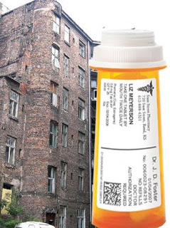
Guy Mastrion (@gmastrion) over at Pixels & Pills Blog took offense when a colleague “bemoaned the conservative design of most Pharma packaging” and said it was “inevitable since Pharma was a ‘Creative Ghetto.'” [See “Breaking Out of the Creative Ghetto.”]
Now, you know, whenever someone mentions creativity and pharma or pharma marketing in the same sentence, I get out my blogging pistol.
When ads like those for Rozerem win awards for creativity but do not help ROI, I am especially annoyed (see “Rozerem Ads Dis Lincoln, Show Beaver“, “MM&M Award Winners Announced at Gala NY Event!“, and “Another Award for Rozerem! This one…not so good.“).
But creativity in package design? Guy throws out a challenge to come up with something better than the traditional pharmacy pill bottle shown in its ghetto habitat in the photo on the left/above.
First of all, consumers do not buy prescription drugs like they do packaged goods. I don’t walk up and down drug store aisles to chose my diuretic. Packaging, therefore, plays no role whatsoever in the process of fulfilling my prescription.
However, there is an area where packaging plays a role in pharmaceutical marketing: free samples given away at doctors’ offices. I contend that there is much creative thought that goes into the design of these packages (ie, “starter kits”). You won’t see any awards, however, for creative starter kit designs.
If you want to see creative packaging, you should look at over-the-counter meds, especially those that used to be branded drugs like Alli. These are placed in prominent positions on drug store shelves with snazzy point-of-sale displays and packaging (see “I Opt-Out of My alli Challenge!“).
So, don’t bemoan pharma package design — where it counts, package design is an investment that pharma makes. Whether it is good design or not is another matter.


![6 Digital Tools at the Center of Healthcare Digitalization [INFOGRAPHIC]](http://ec2-54-175-84-28.compute-1.amazonaws.com/pharma-mkting.com/wp-content/uploads/2021/04/6DigitalTools_600px-100x70.jpg)


