In previous posts, I discussed a few different techniques that pharma marketers could use to create Rx branded promotional tweets that satisfy recently-published FDA guidelines.
One such idea was to attach an image of the required important safety information (ISI) to the promotional tweet (see “A Type of Rx Drug Tweet FDA Did Not Consider in its Recent Guidance“).
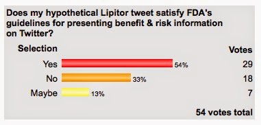
I polled readers about this and a majority of readers who took my poll said, yes, it’s possible that such a tweet would satisfy FDA guidance requirements:
In discussions with the Twitter “pharma team,” however, I learned that on small-screen mobile devices — e.g., smartphones — which are very often used to send and view tweets via the Twitter app, these images are too small to be readable.
There are other problems when viewing such tweets on smartphones.
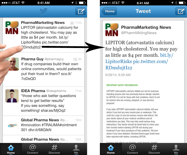
When viewing the tweet using an older version of the Twitter app on an iPhone, the image is not visible in the tweet timeline itself (as seen on the left in the image below) and you must click on the tweet to actually see the image/ISI (as seen on the right). Of course, if you have to click on the tweet to see the ISI, that would be like the search engine ads cited by FDA as violative (i.e., the “one-click rule” is not FDA-approved; for more on that, read “Pharma Prefers “1-Click Rule” for Presenting Fair Balance in Social Media & Other Internet-based Rx Ads“):
In newer versions of the Twitter app (version 6.8 and later), attached images appear below the 140-character tweet right in the timeline itself and you do not have to click on the tweet to see the image. Even so, the ISI text is much smaller that the tweet text, which includes the benefit information. Consequently, even with newer versions of the Twitter app, FDA might not like this tweet as seen on mobile devices because the ISI is not presented using a style and font size comparable to the benefit information.
I suppose it would be possible to fix this by (1) using larger font text in the ISI image, or (2) placing the fair balance information/ISI in the 140-character section of the tweet and the benefits and other promotions in the attached image. For pharma marketers, however, that may be equivalent to putting the carriage before the horse.
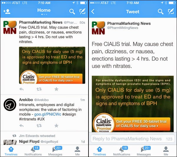
Here’s how a fix #2 tweet might look on an iPhone:
I’m not sure if the ISI, which is presented in the tweet itself is enough to satisfy the FDA, but let’s just say that it is. Would this “carriage-followed-by-horse” style tweet pass muster with the FDA?
| Does my hypothetical “carriage-before-the-horse” CIALIS tweet satisfy FDA’s guidelines for presenting benefit & risk information on Twitter? |
|
Yes No Maybe |
P.S. Will Twitter’s Card Technology Allow Pharma Brands to Post FDA-Compliant Promotional Tweets? Read my opinion on that here.


![6 Digital Tools at the Center of Healthcare Digitalization [INFOGRAPHIC]](http://ec2-54-175-84-28.compute-1.amazonaws.com/pharma-mkting.com/wp-content/uploads/2021/04/6DigitalTools_600px-100x70.jpg)


